Traditionally, photographers do not have the same knowledge about color theory as painters do. But color is an integral part of our world and it is important to understand how different colors can affect our perception and emotions. Some basic knowledge about color theory can give you a better understanding of how to capture it in your images and that will take your photography to the next level.
Additive and subtractive colors
Color theory for photography is based on theories that painters have been using forever; that all visible colors can be produced by mixing a few primary colors. The three primary colors of light are red, green and blue. When these colors are mixed together, they produce white light. But different combinations of these primary colors can be used to produce all the colors in the visible spectrum. The mixing of equal parts of these primary colors (RGB) is known as the Additive method. The other method is called the Subtractive method and it is applied by mixing cyan, magenta and yellow, which are the complementary colors to the RGB primaries. When mixing subtractive colors in equal parts the result is black. Also, mixing the subtractive primaries in different combinations can produce all the colors of the visible spectrum. Usually, photography is more concerned with additive primaries (RGB), as they are the colors that produce light.

RGB – Additive color primaries
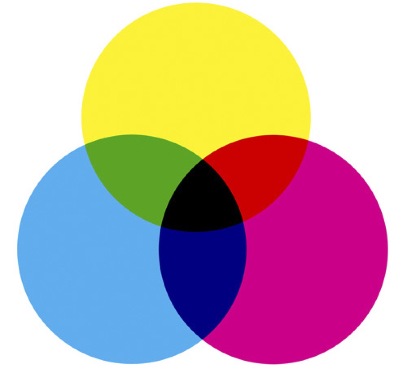
CMY – Subtractive color primaries
The perception of color
Colors have a strange way of giving an image temperature. Golden, yellow and red tones cause spiritual associations and seem very warm, while blue and yellowish-green colors seem cold. Warm colors, especially if they are darker, work in a way that makes the object seem heavy and massive. While pale, cool colors give the object a sense of lightness and airiness. In addition, warm colors have an easier time bursting out, while cool colors seem to pull back. You can apply both principles in one picture by placing an object of a warm color on a cool color background. That way the object will attract even more attention.


Pay attention to the overall feel of the images: the image in the left is mostly blue and cool, while the image on the right is more red and warm.

Placing a warm color object on a cool color background will make it pop
Understanding how color is recorded photographically is nothing without the understanding of how colors effect our perception. The brain interprets all information that comes through your eyes, and that determines what and how you see.
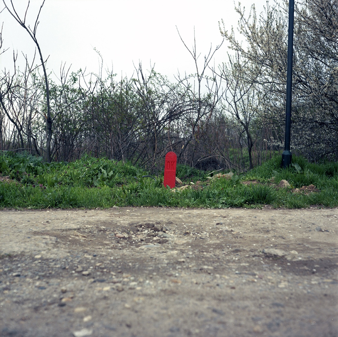
Red color is associated with danger, that is why you eye is immediately drawn do the red object in the image, despite its small size.


Using color theory principles in photo editing will give you more control over the process
Knowing how to use color theory in photography will expand your abilities and understanding on why some images may not be as effective as others. Colors in photography do not always have to be technically correct, with some knowledge about color theory you can make the natural colors and light sources work to your advantage. Observe the world even when you don’t have your camera with you and you will start recognizing some of these principles everywhere you go – in nature, architecture and design.