The most important element of color theory is the color wheel. It is a circular depiction of all the colors in existence, transitioning one from another. A traditional color wheel is made up of primary, secondary and tertiary colors and each color is complementary to the color opposite to it on the wheel. The three primary colors are red, blue and yellow. By mixing two primary colors we get secondary colors. Mixing yellow and red results in orange, blue and yellow make green and red and blue make purple. By mixing primary and secondary colors, the results are tertiary colors.
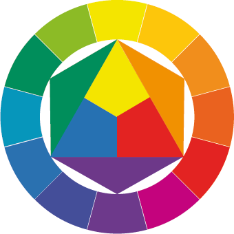
Color wheel by Johannes Itten
Complementary colors
The contrast between complementary colors is a contrast of difference. These are the colors that are the most saturated and have the biggest distance between them in the color wheel. Because there is such a big contrast between these colors, using them together in an image can make a certain part of it really stand out.

Pay attention to how blue and yellow vibrate against each other, although they are not complementary colors
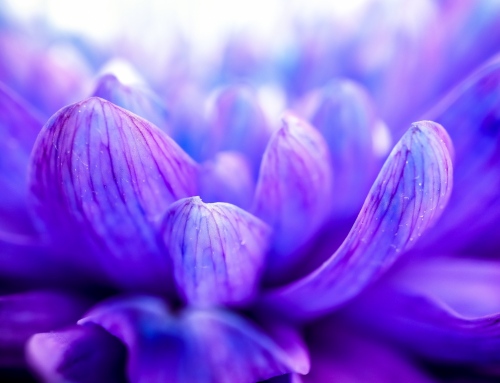
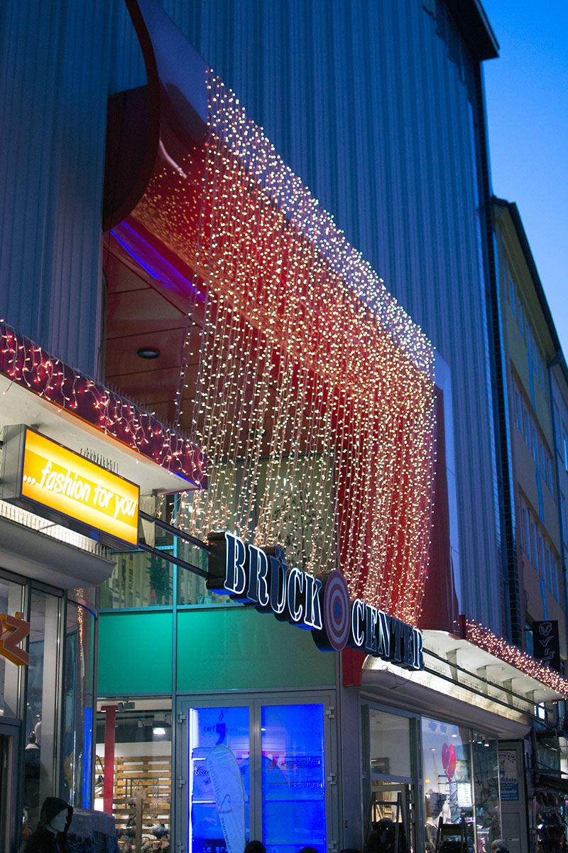
Blue and yellow are not complementary colors, but they are far enough on the color wheel to be able to vibrate against each other. When we use two highly saturated colors in one image, the relationship between the two becomes an interesting visual dance. Keep in mind that pairing two colors together that create such strong visual vibrancy can be overwhelming for the viewer. Having equal amounts of two complementary colors in a photograph creates stress, which is why photographers usually chose to only accent a part of an image.
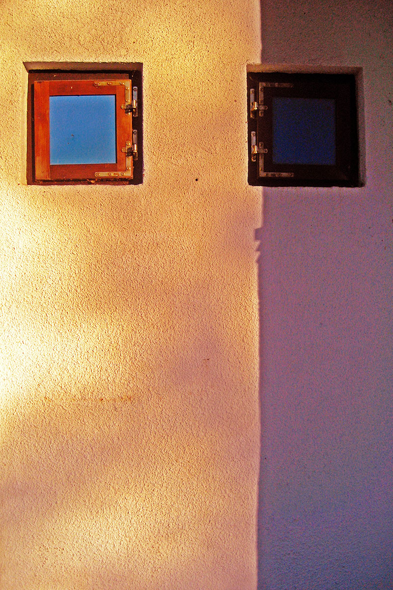
By accenting only a part of an image with a complementary color, we can relive some stress for the viewer
Analogous colors
The contrast between colors reduces as we replace primary colors with secondary colors and even further when we move on to tertiary colors. Harmony between colors means a result that is more visually pleasing then other color combinations. When we are in nature there is a great possibility that the colors that surround us are largely the same. Forests, deserts or the seaside are mostly environments made up of analogous colors, which are closer to each other on the color wheel. They naturally work together, making them easy to look at.

Green and yellow stand side by side on the color wheel
Next time you go pick up your camera, try not to only pay attention to the subject, but also on the colors surrounding it. Color can add emotion to a scene, especially when you start gaining control over it. Think about the time of day you are shooting in, as the lighting changes depending on the position of the sun. That way the color cast can be used to your advantage.
Harmonies
Color theorists have tried forever to develop a system which would allow an objective determination of a color harmony and in a way that scientifically explain its rules. Through science they figured out that a color harmony is made up of a combination of colors, which induce a psychophysical balance of perception. That state is supposedly caused by a neutral gray color. In short, a color harmony is based on a combination of colors that if mixed together, make a neutral color – that includes all complementary pairs of colors.
Harmonic combinations of colors are divided into dyads, triads, tetrads and hexodes.

Harmonic dyads are all complementary pairs of colors, which we’ve described earlier.
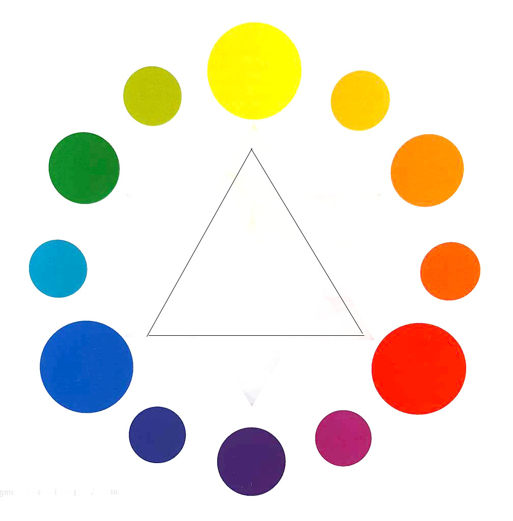
Harmonic triads are combinations of colors that are connected by an equilateral triangle in the color wheel. The strongest of these combinations is the triad of three primaries: yellow, red and blue. By turning this triangle we are able to create many harmonic triads.
A triad of three primaries: yellow – red – blue

Harmonic tetrads are created by combining two pairs of complementary colors. That way the colors in the color wheel are connected by a square or a rectangle which we can keep turning and observe many types of tetrads.
Harmonic hexodes occur when we inscribe a hexagon in the color wheel. That’s how we get a harmonic combination of three pairs of complementary colors, for example: yellow – orange – red – purple – blue – green. Turn the hexagon to find more interesting hexodes.

Search for harmonic tetrads in your environment: blue – green – orange – red
Plan out when you are going to take pictures and choose the most colorful times of day or night. Warmer colors are more intense then cooler colors – that is why they seem to pop out of an image. That is why you might want to have more blue in an image with only a highlight of orange, because it is much more intense. Admittedly, all of these are only guidelines, not rules. The best way of learning these principles is by trying and training them practically.