
No comments yet. All fields are required, fill in the form. Comment successfully added. Comment
Michael Mariant May 29, 2015 01:17 PM
Read comment →
I really like your editing choice of this image from that morning, with the light slowly creeping down the face of Manly Beacon. Instead of the stark lighting or just the tip, it's almost as if it is revealing itself to you as you view the photo. Well done. |
|
No comments yet. All fields are required, fill in the form. Comment successfully added. Comment
Michael Mariant May 29, 2015 01:19 PM
Read comment →
Excellent composition with the focus on the texture, shapes and patterns. Almost wish to see a version with less shadow detail, as my eye goes there to see what is to be revealed. Takes away from the strong patterns above. |
|
No comments yet. All fields are required, fill in the form. Comment successfully added. Comment
Michael Mariant May 29, 2015 01:19 PM
Read comment →
Good use of focus as a tool. The background tree provides the definition of what the viewer is seeing while keeping the scene simple and dynamic. |
|
No comments yet. All fields are required, fill in the form. Comment successfully added. Comment
Michael Mariant May 29, 2015 01:20 PM
Read comment →
I'd recommend a bit of vignetting around the edges to keep the eye drawn to the highlight of the flower. The background branches are distracting, especially in the top right, and vignetting will greatly help that. |
|
No comments yet. All fields are required, fill in the form. Comment successfully added. Comment
Michael Mariant May 29, 2015 01:28 PM
Read comment →
The color seems off here. Looks like too much shadow detail preserved and the blue white balance just throws off the warmth or clean sunlight areas. It creates a perception of increased contrast, yielded through the color shifts of cool blue from the shadows. The composition and depth of the image is nice, but the strong shadow information that was brought up flattens the image and makes the overall color of the shot blue. Perhaps bring back down the shadows, which would add depth to the photo. |
|
No comments yet. All fields are required, fill in the form. Comment successfully added. Comment
Michael Mariant May 29, 2015 01:28 PM
Read comment →
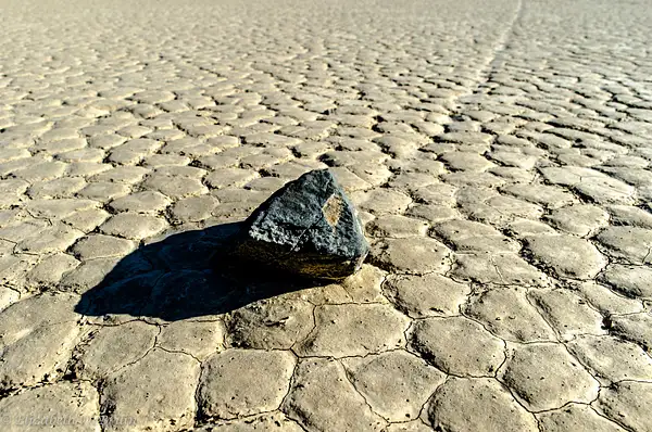
Very, very good! Beautiful capture of the background shapes and pattern, with the steak of light across the center and bottom revealing that beautiful sand texture. Very well done! |
|
No comments yet. All fields are required, fill in the form. Comment successfully added. Comment
Michael Mariant May 29, 2015 01:30 PM
Read comment →
This has the similar post-results of the Devil's Golf Course with lots of blue color temerature in the shadows due to them being brought up in post. I would recommend to desaturate the shadows (which is normal for the eye) or push the shaodws back down, which would help emphasize the contrast on the wooden tombstone. Great perspective! |
|
No comments yet. All fields are required, fill in the form. Comment successfully added. Comment
Michael Mariant May 29, 2015 01:30 PM
Read comment →
Good balance within the frame. Nice execution of the "if you have great clouds, just put something in the bottom of the frame!" |
|
No comments yet. All fields are required, fill in the form. Comment successfully added. Comment
Michael Mariant May 29, 2015 01:32 PM
Read comment →
it took me a bit to read this photo, which is a really good thing. Lots of information and depth to the photo, both literally and figuratively. It is complex, which is what you want to engage the viewer. Only comment would be to crop the sky out of the top of the frame. Don't crop into the photo, just crop the top off so that the 1/4 of blue up top isn't so strong. That will help keep the eye focuses on the reflected scene and the bottles and cans through the window. Very well done! |
|
No comments yet. All fields are required, fill in the form. Comment successfully added. Comment
Michael Mariant May 29, 2015 01:33 PM
Read comment →
Interesting. I wouldn't say it is one of your better pieces from the course, but good use of texture and patterns. I have to keep rectifying with myself that I am not looking at skeletons! |
|
No comments yet. All fields are required, fill in the form. Comment successfully added. Comment
Michael Mariant May 29, 2015 01:35 PM
Read comment →
Very well done. Excellent capture of the texture, great balance of the photo with the ladder and window, and the recovery of the shadow detail ever so slight in the background provides a bit of revelaing information for the viewer, but still goes to black providing critical depth of the background wall. In addition, the cyan shift in the shadows works very well with its complementary color of red, which is dominant throughout the image. If the train car was a different color, the cyan shadows might conflict. Because of the red, they work very well together and are pleasing to the eye. |
|
No comments yet. All fields are required, fill in the form. Comment successfully added. Comment
CuriousLizard Apr 29, 2015 12:31 PM
Read all 2 comments →
OK Mike |


No comments yet...
All fields are required, fill in the form.
Comment successfully added.
Comment